Friday 23 April 2010

Final Magazine


Evaluation

Evaluation Media Completed

Wednesday 14 April 2010

Evaluation

1. In what ways does your media product use, develop or challenge forms and conventions of real media products? (i.e. of music magazines)


2. How does your media product represent particular social groups?


3. What kind of media institution might distribute your media product and why?


4. Who would be the audience for your media product?


5. How did you attract/address your audience?


6. What have you learnt about technologies from the process of constructing this product?


7. Looking back at your preliminary task (the continuity editing task), what do you feel you have learnt in the progression from it to full product?

Wednesday 24 March 2010


Sunday 21 March 2010

Things To Include On Front Cover

Market Research

Chosen Double Page Spread Photo


I have chosen this as the double page spread photo because i think the busy background makes it very striking. Hannah's pose also gives off alot of attitude which is also the mood that is presented within ther interview. I will be using this picture to cover the entire first page of the double page spread as this is an effect I have seen on alot of the existing double page spreads that I have been looking at and I have found that it gives a very proffesional look. I will be putting a large quote over the image that i will chose carefully from a section of the interview. On the seconf page of the double spread will be a short introduction to the interview and then three columns of writing. I will make the interview informal and chatty and use colloquial language so that it really appeals to my target audience. I will be usiing the font 'Centaur' as it looks very proffesional and is often used in magazines and newspapers. I will be scanning ina number of objects and placing the images in an overlapped fashion in the bottom right hand corner of the second page of my double page spread to give the spread an arty look and hopefully make my overall work have an abvious running theme through each section.

Chosen Front Cover Image


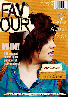
After much deliberation I have decided on a photo to use for the front cover of my magazine. The reason I have chosen this photograph is because firstly I believe that it has an unconventional look because of the way the main focus of the image is the side of Hannah's face and secondly the feeling of attitude and status within the piece. Hannah appears dominant and in control which i believe helps to make the magazine look proffessional and appeal to a slightly older target audience which is extremely important because i believe there is a real niche in teh market for an indie styple magazine aimed at females in their late teens. The brick wall that is the background of the photo does not fit in very well with the indie style theme so i will be cutting the photo out using the magnetic lassoo tool on Photoshop. For the background I will be scanning in a brown coloured parcel wrap and altering the contrast on it so that i turns slightly yellow, this will really make Hannah stand out and help grab the attention of customers.

Photos of Model

The Photoshoot.


On the day of the photoshoot myself and Hannah went out into the rural parts of Lutterworth town to take photos to be used on the front cover, contents page and double page spread of my indie music magazine. Before going to the chosen location i chose how Hannah hair, makeup and clothing would be represented. Because i inteneded to take some quite close-up photographs i did Hannah's make-up in a very quirky style that will grab the attention of the customers. I chose to use a stiking black lipstick on hr upper lip for a unique and unconventional look that works very well with the indie style taht i will be portraying the whole way through my magazine. I chose for Hannah to wear a brightly coloured turquoise shit, buttoned to the top as this is very typical of indie fashion and therefore will appeal to teenage girls who are the tearget audience, i chose for her to wear contrasting black tailored trousers to make the shirt stand out furthur and lots of chunky jewellery which is also very typical of indie fashion.

A Few Photo I Have Chosen To Analyse.

Full length body shot.


For this photograph i have placed Hannah on the right hand side of the shot, although a busy background has been used she still manages to be the main focus of the shot because of her brightly coloured shirt. If i were to use this as the main image on the front cover it would allow for alot of text to be placed on the left hand side of the image although a very limited space is left for text on the right hand side of the image, this problem could be solved by cutting out Hannah using the 'magnetic lassoo tool' on Photoshop and placing her in te centre although this would mean she would then be on a plain background which may take away from the 'arty' effect which is given off by the urban graffitti background which i believe ties in very well with the indie theme.


Mid-Shot.

Hannah is central to this shot which i believe will really grab people attention, the way that she is looking away from the camera also exudes confidence and gives her the appearance of being important. It is important to me that my cover start looks empowering and dominant to make for a very powerful shot. By Hannah looking confident and in control my magazine will also look far more proffesional which is very important.


Action Shot.

Although this shot doesn't seem to be very strong i think that i could use it as a smaller image perhaps on the contents page or the second page of the double page spread, i think that this shot, along with 3 or 4 similar shots, placed in a film strip or photo negative strip at the bottom of a page would be very effective and also backup the influence of art within my magazine
Align Left


Low Angle Shot.

The low angle shot that i have used for this photos makes Hannah look dominant and in control and as if she is someone who she should be looked up to. This will help to make her somebody that the target audience feel like they could aspire to be. It is extremely important that the photo i chose for the cover appeals to the target audience as they will be the people hwo the photo is aimed at and who will be buying the magazine.


Side Profile.

I think that this shot is very effective as it shows off the full extent of Hannahs outfit and the gaffitti background contrasts perfectly with her outfit and hair. Unfortunately Hannah is to far towards the left of the photo for me to use this as the cover photo, i could solve this problem by either cutting her out and placing her into the centre of the image onto a plain background or i could use this image on the double page spread and place a large quote over a section of the image.


Looking to one side.

I really like the effect that this shot has given the photo as the relaxed posture of Hannah's body makes her appear approachable and friendly, this will help entise in the audience, i could furthur represent this 'friendly' theme by used no capital letters in the masthead and a soft and rounded font, this font will contrast well with the busy photos and help it t stand out.


Slightly Too Small.

A long shit has been used here which means that Hannah is quite small compared to the size of the actual photo, this however shouldn't be a problem because i used an extremely high resoloution camera so if i decidedthat i wanted to use this photo then i could simply zoom in and crop the photograph. I like the neutral colour scheme of the background of this photo as it really makes Hannah stand out.


A Less Striking Shot.

This shot is far less eye-cathcing as Hannah appears to not be concentrating and doesn't seem to be very dominant. I won't be using this photo because it is not striking and doesn't make for a good cover image.

Quirky Shot.

I am very fond of this quirky shot as it really shows the unconventional theme than runs within all aspects of an indie lifestyle, this close up shot also shows of the original make-up that i have chosen to use on Hannah.I would not however be able to use this shot on the front cover as there is no room above Hannah's head for a masthead.



Pitch for Magazine

A contempory look at the indie music scene with interviews, fashion tips and best of the fests.

The pitch for a magzine is usually under 25 words long and is an extremely short description taht explain the basics of a magzine, usually shown to somebody you are pitching the magazine to (for example a retailer whos shop you wish to sell your magazine in or somebody you want to invest in your magazine).

Destination of Photoshoot


One of the destinations I chose to use for the photoshoot was a large grafittied wall. The reason I chose this location is because I think it will make the images very striking and certainly attract the attention of my target audience. This unique background will also tie in well with the home-made arty effect that runs as a theme through the sections of my magazine. The bright colours in the image will also helps to really make Hannah stand out as they will contrast well with the bright green shirt that i have chosen for her to wear on the day of the photoshoot.

Another destination i have chosen for the photoshoot is an old faded brick wall, I believe that this will look good and give the magzine a rustic effect. Also, if i do not like the brick background, the colours of the bricks are very different to the colour of Hannah's hair and outfit so it would not be too hard to cut out on Photoshop.

The final destinationI chose for the photoshoot was a childrens park, I am unsure about whether I will use the pictures form this destination although I hope that these pictures will be able to show a playful side of Hannah and maybe add slight humour to the images.

Content of Double Page Spread

She has hair as feiry as a shot of Tabasco, lives for everything indie and loves nothing more than a spot of karaoke with her mates. Favour catches up with with fiesty chart topper, Hannah Scoular.

Unless you've spent the last three months sipping cocktails on an island somewhere in teh sun, you're sure to have heard of Hannah Scoular. In fact, even if you have been away, odds are you will have heard a local humming on of her infectious tunes.
Born Hannah Rose Scoular, teh 17 year old recognised her dream of being a musician as soon as she was old enough to warble in her pram. Although it may seem as if Hannah has been an overnight sensation, her success is in fact down to singing in run down pubs and small gigs since the ripe old age of 11.

As soon as Hannah walks into the room it is obvious taht she is every bit the self-assured star that she seems to bei n her quirky high energy usic videos. Hannahs multicoloured fingernails are gripping an overflowing glitzy planner which is almost as farcical as her personality, it is bulging at the seams with appointment, interviews and upcoming events so I decide to crack on with the interview before the next star-struck journalist has their turn with this ever so intruiging teen.

Were you suprised at what a massive hit 'im not sorry' was?
[Grins.] Totally! I still do a little squeal everytime i hear myself on the radio, it's so unreal! I just feel so lucky to finally be showcasing my love for music.

Did you pinch yourself when youheard it had gone to the top of the charts?
Yes, I couldn't believe it, i was out for a meal with a few close friends when my mum rang me with the good news, I almost collapsed in my carbonara!

Chosen Model For Cover


The model I have chosen for the front cover of my magazine is 17 year old Hannah Scoular. I have chosen to photograph Hannah for a number of reasons, firstly, i believe that she will really appeal to the target audience as she will appear to be somebody that teenage girls can relate to, this is very important as it will attract the attention of th target audience. Another reason i chose to photograph Hannah is because she is extremely confident which really communicates well through the photos i have taken, it is incredibily important when taking photos of somebody for a purpose such as this that they are very confident in themselves and comforable with having there photo taken because if they do not feel comfortable this will really show and may even make the reader feel uncomfortable and makes the magazine seem less proffesional. I also chose Hannah because she often wears very indie outfits and therefore portrays the genre perfectly, it is very important to me that all aspects of the magazine will be representing the indie theme so Hannah was the perfect choice. Hannah is also very photogenic and i am very pleased with the photos that i have taken as i am not restricted to a select few. On the day of the photoshoot i managaed to take 303 photos of Hannah as aprt from a handful that were out of focus the vast majority could be used which is great because i had a really large selection of photos to work wth and experiment with different styles of editing with. Hannah also has a quirky haircut and unconventional hair colour which will furthur help to attract the attention of the target audience.

Mastheads


The masthead that is used for a magzine is incredibly important as it is normally the only part of the magazine that is visible when on sale in the shops, this is why almost all magazine mastheads are placed in the top quarter of their front cover. Below are a few mastheads of well known magazines, looking at these has helped me figure out how i will be representing my own magazine title.

The title of my magazine is 'Favour'.


'Q' magazine has a very simple and effective title that is placed in the top left hand corner of the cover. It is written in white and placed onto a red background to really make it stand out. i think that this masthead is very effective and ties in well with the colour scheme that runs throughout the whole magazine. A famous female is also placed right at the top ofthe magazine so that it can also be seen whilst on display in the shops, the use of an easily recognised celebrity gives a magazine instant status and this can really set it apart from the rest. A very dark colour scheme is used on this magazine as it is aimed at adults. I effectively be doing the opposite with my magazine and using a vibrant colour scheme as it is aimed at a younger audience.


The masthead on this magzine in partly covered, again by a celebrity. The way in which the mathead is covered shows that it is a well known magazine and people will recognise the styple of the magazine without actually having to read the full title. I like the way in which two lines of text have been placed above the masthead to show the audience what is inside the magazine and this is very effective way of boosting sales, I do however think tha the font used for this mathead is very plain and boring and would not atall suit my magazine.


Again, an extremely simply format has been used for the masthead but it still looks effective. So far I have found that with all the magazines I have analysed ad looked at, the masthead is always written in the colour that dominantes the colour scheme, this is something that i will really have to bear in mind when creating my masthead. The border around the letters definitely elps to make this unusually small masthead stand out. If i were to improve this title I would make it about 50% bigger to really attract the eyes of the target market.


I really am a fan of this quirky looking masthead and it is definitely something I would be interested in developing. This quirky style would work fabulously with my indie theme. If i were to use this styple i could easily hand draw it for a more personal and arty effect and then scan it into the computer, I would however use a more indie colour scheme (either neutral or vibrant depending on the other colour on the cover.) I will efinitely be using an usual masthead to set my magzine apart form the rest as their is alot of competition between magazines and the more unique I can make mine lokk the better.

Double Page Spread Analysis

Double Page Spread Analysis


After designing and creating a cover for my magazine will be creating a contents page, the contents page i will be designing will only be a single page but i have been given some very good ideas by looking at this double page contents from a food magazine. I like the large picture on the right page as the bright colours of the asparagus really contarast well with the sheer white of the back ground.


I am very interestind in re-creaing this look myself using a pair of pink converse shoes which i think relate to the genre of my magazine perfectly, I will be using the same composition as in the this picture with the overlapping and i am also interested in using the shadow effect as it really make the image stand out. A very rounded font is used for the enlarged numbers on this page, this makes the magazine appear freindly and laid-back, i am also hoping to achieve this mood for my magzine and therefore will be using a similar font. Although i usually do not like things to be represented in an organised and totally paralell way i really like the simplistic effect that has bee created with the line of contrasting photos on this page, i could re-create this effect on my cover by photographing objects related to indie (possibly an acoustic guitar or quirky watch).

Contents Pages Analysis

Contents Pages Analysis

Critical Analysis of Raygun Magazine Front Cover


Raygun Magzine.

Raygun magazine is a music magazine with a heavy art influence, this magazine really inspires me as i am very into art and would really like my magazine to have a strong art influence that is very apparant. Raygun does not follow the typical dynamics of a magazine as the masthead it not placed the very top of the magazine and all of the text is the same size. I particularly like the'typewriter' font that has been used as it has given the cover a very rustic look. Andy Warhol has been used as the cover star of this magazine, in the picture Warhol is showing the whites of his eyes the whole way around his iris, this makes his seem shocked and the wide-eye look is very effective at helping to pull the consumers in as it really makes you stop and look at the picure. The pictures only reaches just beyond half way up the magazine cover and it stopped at the bottom of the mans forehead, this makes the picture look fascinating and unconventional which helps the magazine to seem unique. Making a magzine unique is very important because with sucha wide variety of magazines on display in shops it is important to do whatever is needed to make the consumer take a longer look at your magazine. I am very fond of the black, white and red colour scheme that is used on this, i could adapt this colour scheme to wrk with my genre by substituting the pale red for a neutral khaki green to fit in with the neutral colours that are so often involved within indie fashion. I like the granulated look that has been given to this picture as it makes it look vintage, i will not be using this effect on my main picture as it is very important that my magzine looks brand new and up-to-date so that it can reflect the use of up-to-date artists featured inside. I will be very interested in using elements of this cover on my own cover, espeically the off-centre writing and a-semetric lines. I will also be looking through differnt issues of 'Raygun' to see what other ideas the designer has to offer as i am very inpired by their work.

The masthead to 'Raygun', unlike other magazines, is not the same evry week as the font, postitioning and size variates from issue to issue, this is yet another element that sets this magazine aside from the rest. I would be reaslly pleased if i was able to make my magazine as unique as 'Raygun', i can achieve this in a number of ways such as, a 'lob-sided' layout with lines that are not parelell, a picture cut off with a straight line and a simple but effective font.


I am very fond of the layour used for the masthead of 'Raygun' however i also like a contrasting masthead which has been used for the magazine 'Blender'. (Pictured below)


Blender Magazine.

As 'Blender' is a well known magazine they have been able to cover an entire letter of the title without concern about people not knowing the title of the magazine. They have covered a portion of the title with a photograph of a famous person that they believe will appeal to the magazines target audience, by having this photo visible at the very top of the magazine it enables it to be shown in the shop when a large variety of magazines will be overlapped with only a small section of the top of the magazine visible to the customer, this is done to boost sales and also gives the magazine status. Blender have chosen to use a 'broken' looking font which communicates their rock genre and compliments the scruffy look of the full length shot of the man used as the main focus of the cover. A deep red is used which can show danger but also makes the magazine stand out and allows it to be more eye-catching. I am particularly interested in this magazines masthead as I think I could incorporate elements of this mastheads presentation into my cover as it would fir in well with my indie theme.

Critical Analysis of Indie Magazine Front Cover

A very striking picture of a very famous music artist is used to grab the attention of customers on this 'Citizen K' magazine cover. The use of such a well known singer lets the readers know that this a very high-budget and serious music magazine, its also really defines the target audience to people who are interested in the music that its represented by the artist featured on the cover. Because the top few inches of the magzine is likely to be the only section visible to customers whilst on sale in the shop 'Citizen K' have decided to overlap the masthead with the of face the well known artist, this will let everybody know who is featured in the issue and hopfully boost sales by people who are interested in this particular artist buying the issue. A very neat structure is used for this magazine, this shows that the target audience for this magazine is for slighly older and slightly more neat and upper class people than magazines with more 'scattered' layouts such as 'Vibe' and 'Smashhits!'. The price on this magazine is backed on a different colour than the rest of the cover to make it really stand out, it is very important that i price my magazine well. If i price my mgazine to high then the targte audience will not be able to afford it as they are only teenagers and may not have a job or a disposable allowance, i also need to make sure that i do not price the magazine to low as then not enough profit will be made and also a low price make make people think that the magazine is slightly tacky and/or lower class. The typical three colours colour scheme is used on this magazine cover with black white and grey, this drab colour pallette makes the cover seem civilised and also gives the impression that it is aimed at a middle-ages target audience. The bland colour scheme makes the red star on which the price placed stand out even furthur to the customer, the star is also placed high up the magazine, i believe in the hope that it will show when positioned in the shop, perhaps with more expensive magazines. This will help sales of the magazine. All in all i think this is a very effectve magazine cover although i am much more fond of a rougher less structured apperance personally.

Target Audience

Defining my target audience will be key to my research as i cannot make any decisions about presentation, fonts, mastheads, colour schemes or any other important parts of the magazine cover without knowing who i am aiming the magazine at. After looking at a few examples of exsisting indie style magazines i have decided that the target audience for my magazine will be girls aged 16 and over, most of the indie magazine that are in shops at the moment are aimed at both boys and girls of a usually older audience. It is also very important to me that i represent all areas of indie through imagery and text within my magazine. Although my magazine will be aimed purely at females i do not want to over-do the cover with bright pinks and stereotypically 'girly' features as indie colours and more neutral instead of bright generally. Another thing that i will have to consider is the size of the magazine, all current indie music magazines are A4 size, this makes them easy to flick through and enables for alot of information on each page, however, recently some fashion magazines have been printed onto A5 pages, this makes them fit well into handbags which may come in handy as my magazine will primarily be bought by females. All of the A5 size magazines are aimed at women as the smaller size would not work well with mens hands as they are normally much bigger. To help me decide what size to make my magazine i asked 30 girls from the target audience age range which sized magazine they prefered, out of the 30 girls only 6 say they preffered the smaller sized magazine with comments such as 'its so easy just to pop in your bag for the bus' and 'i really like the more petite magazine as its really easy to hold when your lying down in bed' on the other hand the 24 gilrs that preffered the A4 sized magazines said that they find the smaller versions to fiddly and the writing 'barely readable'. After talking to these girls i have decided tat my magazine will be printed onto A4 pages, this will allow me to hopefully fit more information onto my double page spread. I will also have to decided on the age and gender of the person that i will be using as the cover star, an 18 year old boy is likely to attract the eye of the girls but a teenage girl is also likely to grab there attention as they may see it as somebody to relate to. I will also have to decide what text will help to attract my target audience, i can use up-to-date slang words to help the readers really connect with the magazine and therefore hopefully boost sales. I will also have to consider the positioning of the magazine in the shops, as teenagers do not generally spend alot of time in newsagents and paper shops, it would be a sensible idea to position the magazine at eye-level so that they will hopefully see it as they walk by, a striking masthead should also help to achieve this. During every decision i make i will have to consider my target audience because every single piece of the magzine needs to appeal to them because without them the magazine will not sell.

Wednesday 10 March 2010

Indie Fashion

Indie Fashion.


Indie is a very up to date genre and is generally associated with the younger generation. A very large part of the indie lifestyle is fashion. Although the magazine I will be making will be a music magazine it is important that all the lcothes thata re featured within the photo reflect the indie genre and attract the eye of the reader. The target audience for my magazine is teenage girls and it is important that i use their style influences within my photography. Below are examples of indie fashion.


I particularly like the quirky stance of the girl int his image and i believe that this would be a very strong double page spread image. The picture could be improved with the use of an artistic background. I also think the picture would appear more proffesional if the lighting was altered so that the girls face appears brighter, i think that this would give the image an overall more proffesional look.


A very obvious neutal colour scheme has been used on this image which is very typical of indie fashion. Although teh clothes look very up to date and fashionable I am not sure that this neutrally based colour scheme would stand out well enough on my magazine, I think this outfit would be perfect if a vibrantly coloured jacket or over the top accesory was added to grab the audiences attention.


The use of the hat in this image would mean that cutting around the image would become very easy as so far whilst using Photoshop I have found difficulty when cutting around my models hair and applying a hat would solve this problem. This would make for a much stronger cover image if the girls eyes were focused on the camera to really draw in the customer. if i were to use this kind of shot on the cover then i would really zoom in to make sure that the model is the main focus of the magazine and to retain a proffesional appearance.


I would never choose to use a back view as a front cover image as it is not strong enough and makes the magazine appear impersonal. I do however like the clothing within this image and the simplicity would work well with a more intricate background. I would however edit the hue and saturation of the picture so that the duller colours became more intense.


I like the busy background that has been used on this image as it really makes the central image stand out and although it is very busy it does not take away from the image. I like the posed used on this photo as the male looks very relaxed and confident. It is very important that the model used on the fornt cover looks very confident as if they look shy or embarassed it can easily make the reader feel uneasy.

Indie Music

To inspire me when creating my magazine I have been l istening to indie music. A band I have become particularly fond of are 'The Born Ruffians'. They are a canadian Indie/Rock band i believe that they portray the genre perfectly.


Indie Moodboard

What is Indie?

Coursework Start

Today, I will be starting coursework in media. For the coursework i will be designing and creating the front cover, contents page and double page spread of a music magazine. For the magazine i will need a specific genre so that i can determine who my target audience will be and then decide on all furthur elements of the magazine such as the colour scheme, font style, masthead, overall mood of the cover and the picture to be used on the cover and then what will be included in the contents page and double page spread. The cover will be extremely important as it is all that the customers will see when deciding whether or not to purchases the magazine or not. To help me to make my effective and up to the standard of the current market i will be analysing exsisting magazines.

The genre i have chosen to use for my magazine is Indie. I will be aiming the magazine at females aged 16 and over and while my magazine will prodominently about indie music i will hope to represent the creative side of the indie lifestyle within my work.

Richard Dyer- The Matter Of Images

Dyer said: 'How we are seen determines how we are treated, how we see them.' How we see them comes from representation.

I used this theory to help my analyse a programme.

The programme that I have chosen to analyse is 'Skins' which is an energetic drama based on the lives of a group pf 6 rowdy teenagers and is shown on channel 4. Stereotypes are very prominent throughout the series and teenagers are shown mainly in a bad light and scenes of unprotected sex, drug taking and a bad attitude towards education are shown frequently. After studying Rayner's theory of representation I have been able to further discover the decisions that the director/producer has made to display the way in which the 17 years olds have been represented.

All of the scenes shown at the school feature, truancy, complete disregard or utter lack of interest in learning, disrespect to the teachers and an overall bad attitude, the view of the teenagers that is represented within the programme is farcely stereotypical and shows a very narrow minded and one sided point of view.

Another theorist, Richard Dyer argues the importance of images and the way in which people treat people because of the way they look, what they are wearing and there overall appearance, in the programme I analysed.

The Constructionist Approach

-the representation is constructed with a set of ideas and values (producers intent/ intended meaning)

-the context of the representaion is part of the representation (media language choices, anchorage, media form, placement/location, genre expectations)

-the audience reacts to this representation and this depends on their own personal interpretational context: age, gender, political/religous beliefs, nationality etc. (negotiated meaning).

Gatekeeping

A theorist called White (1961) spoke to the (gatekeepers)- that is the people who are part of the decision making process in the construction of the media texts.

Who are gatekeepers?
-BBC commisioners
-Law makers
-Director
-Producer
-Editor
-Audience (recent phenomenom, test screening)

Representation

Rayner, a theorist came up with the theory of representation in the media. He explained representation as 'the process my which the media represent the 'real world'

He believed that this was done using a selection process, he though that the selection process was as follows:
-the decision over what is chosen to be represented and what is rejected.
-the choices made when organising the representation.
-the options taken the focus the audience in a certain way.

When thinking about representation within the media you have to consider the following:
-Who or what is being represented?
-How is the representation created? This could be through Mise en Scene.
-Why is the representation created in that way? What is the intention?
-What is the effect of the representation?

Binary Opposites

Levi Straus believed that the world was split into a series of 'binary opposites.' Essentially one thing can only be defined in relation to something it isn't, for example, there's only fat because there's thin.

Bianary opposites are also used to help to define the symbolic code.

Narrative Theory- Roland Barthes

Action code- Applies to any action that implies a furthur narrative action, for example, non-diegetic music in the film 'Jaws' suggests an attack.

Enigma code- refers to any element in a story that is not explained, for example, who is the murderer. (Adverts only ever have one enigma code)

The Semantic code- any element in a text that suggests a particular, often additonal meaning by way of connotation.

Denotation- word with one meaning.

The cultural code- any element in a narrative that refers to 'a science or body of knowledge,' in other words the cultural codes tend to point out our shared knowledge about the world works.

The symbolic- Something that is used to symbolise something within a piece of media, a form of forshadowing. Can be noticed by looking at a series of binary opposite.

Editing

Continually- The viewer should not notice the cuts, and shots should flow together naturally. The shots should appear to be continuous.

Montage- This style of editing has two functions. The highly political soviet style of the 1920's which sought to create a new meaning out of seemingly unconnected shots. The audience is very aware of the 'cuts'.

Hollywood Montage- In classical Hollywood cinema, a 'montage sequence' is a short segment in a film in which narrative information is presented in a condensed fashion. Editing that alternates shots of two or more lines of actions occurring in different places, usually simultaneously.

Dissolve- creates soft or dream like effect.

Camera Angles

A medium shot- the most commonly used shot in cinema. It is used to show any character interaction.
Close up- used to show the audience something important

Shot reverse shot- used for dialogue, makes the audience feel they are part of the conversation

High angle shot- Camera pointing downwards towards character, connotes power over the object you are viewing. Makes the character appear inferior.

Low angle shot- camera points upwards towards character, makes character appear powerful, superior and stronger.

Tracking shot- camera is parallel to the action and follows the 'subject' or action.

Pan- camera sweeps from left to right.

Tilt- camera tilts to go up and down. Usually to show attractive women.

Short Film- Preliminay Excercise

The first task we did when starting media in september was to create a short film in groups of three, the film had to include 12 to 15 shots and a few pieces of dialogue. We strted by creating a storyboard so taht we knew what we were going to do. It was the first time taht any of us had used a camera for filming so before we started we had a quick playa round with the camera to get used to how it works and how we would go about creating the correct shots, i found that a panning shot was the hardest to achieve because you had to have a very steady hand and move at a constant speed. After filming we plugged the camera into a Mac PC to begin editing, we had alot of difficulties with this as we had erased some key shots because of rewinding the tape and watching some clips, although this did take alot away from our work i am glad we found this earlier on so that we can learn from our mistakes and progress furthur next time we are doing any sort of filming. I will post the video onto my blog as soon as it has been converted into the correct format by the ICT department.

Magazine Cover- Preliminary


As a preliminary task I was to design an A4 page to be used as the cover on a school magazine. The magazine cover had to include a mid-shot, masthead and three or four pieces of suitable text. I worked with one other person and we started off by by choosing the person that we wanted to feature in the mid-shot that would used in the centre of our cover, we chose fellow classmate Hannah Scoular because of her quirky style that would make the magazine seem fresh and young and really help connect with the target audience. Hannah wore brightly coloured clothing when we photographed her, this eventually helped to make the cover eye-catching, this is very important when selling magazines. We decided that the title of the magazine would we 'Survive' and that the magazine would be a guide to students on how to reduce stress and achieve to the best of there potential when in sixth form education. We started off by taking eight photos of Hannah sitting on the floor looking towards the camera, the use of a high angle made her seem slightly vulnerable and inferior which are emotions that readers struggling with the stress of sixth form will be able to relate to. We were very pleased with the photos and after uploading them onto the computer we opened it with Photoshop we then began to cut out the picture to remove the background and apply our own themed coloured to better complement the masthead. Hannah's dark coloured hair merged with a shadow in the background and therefore made the picture very hard to cut out, to solve this problem I zoomed in to be far more precise. After cutting out the picture we added a light purple background so that the magazine will appeal to both boys and girls
The title of our magazine is 'Survival- How to survive sixth form', we used lower case lettering and a rounded font to make the magazine appear informal and inviting to potential buyers.